1: In what ways does your media product use, develop or challenge forms and conventions of real media products.


1. Magazine Title -
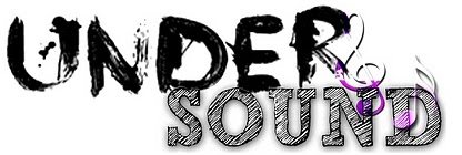
Our title ‘Undersound’ was the best one out of all our draft names. We chose it because we can use it to fit all underground genres and relates to the audience with a personal identity. It is short, easy to remember and eye catching. It makes the audience curious to read more because it is not an everyday word we combined two words together to fit it with the underground genre. It also meant that in our group we could all focus on a different music genre because there are a lot of underground artists who focus on different genres. We had two final logos for our magazine; both were designed to give a free look, because compared to a lot of magazine logos they are surrounded by a box or some other kind of shape. Our design used two fonts both of which have a very artistic look. The word ‘under’ gives it a paint effect and makes it look original and artistic. The word ‘sound’ it like it has been shaded in with pencil. Both words have been chosen specifically to give the magazine an artistic feel. The music notes are placed on the logo to remind the audience that although it is a artistic design, it is still a music magazine. The notes are done in purple, to stand out from the darker colours. It meets the codes and conventions of a typical magazine as it is the thing that stands out the most and is bold and noticeable. However, it differs and goes against the conventions too as it is quite detailed in the design as most magazine mastheads are not.

This title for an Indie music magazine, is very similar to our logo because it has a very artistic and original feel to it. It also looks like it has been created using a textile effect. Colours of the title are similar to our 'Undersound' logo (grey and white). This design differs from our logo design because we used two words in two different fonts and colours, this only uses one. However, they have swapped the colours around on the first letter. This draws your attention to the letter 'F' and it makes me think this is what they use for a logo inside the magazine.
2. mise-en-scene -


We took most of our photos around London (Waterloo, Tower Bridge etc.). Our photos followed the codes and conventions of a magazine because we used various locations in London to give us a wide range of photographs for my magazine. For example, we wanted to connect with our audience using iconography. We used iconic locations such as Tower Bridge. These places fit in well with my magazine because our logo was artistic and original just like the graffiti tunnel was artistic. The reason why we chose these places was to show our artist (s) were from London.
3. Costume and props -


This is the main elements of the clothing i was wearing. I wore a cream dress which flowed to give myself a elegant look, I also wore a gilet to make my outfit a bit more casual as the character I was posing to be was a young girl around 13-16 so it needed to remind the audience that this photo is not of an adult but a teenage girl. I also wore 'milatary' boots which made the outfit a bit less elegant and still showed the teenage girl in the photo. I wore minimal jewellery as the background (graffiti) was going to be loud and that was the main focus along with my clothing. I didn't want attention drawn away from this. This outfit was quite unconventional because you wouldn't expect to see a young teenager on the front of an indie magazine, it is normally adults. However, it can also be argued that it is conventional because I used the age group in my images to match the age group of my audience.
4. People -


These are the three people I used in my magazine cover, contents page and double page spread. The people in my magazine are kind of unconventional. This is because they are young teenage girls. You would normally expect to see people of their early twenties in an indie magazine. Also, a lot of indie bands/artists are normally male, so this is completely unconventional as I've used three separate, single girls. However, as my target audience is young, this relates well to them as it is slightly a more female biased audience but I have still aimed to please the male audience too. Therefore, this unconventional form, won't be a problem in my magazine. My female audience will be able to relate to the main story of my magazine because it features a single artist who is also female. I feel as if my target audience would prefer to read about young artists rather than middle aged artists because they can really connect with them and see them grow and their career.
5. Title Font and Style -

Our title was created in photoshop. We got two different fonts from http://www.dafont.com/ and they were edited in photoshop. We used blend mode and colour filters to edit it and give it this effect. I think this title is a conventional aspect of my magazine because we took our photos in a graffiti area and this fits in with the mise-en-scene. It is almost like the title is graffiti itself. Also, I think that it relates to our audience (as teenagers) as it is colourful and artistic its is more of a picture than words so it will attract their attention.
6. Written Content -

My written content fits in with the main conventions of an interview from a real magazine. I asked questions like, how it feels to be recognised, what made you start singing and who is the actual person behind the singing star. All of these questions in some shape or form would normally be included in an interview with someone for the first time. As I was interviewing a teenager, I didn't ask too many questions and they wasn't difficult to answer and not personal as she is just a 13 year old.
7. How your magazine suggests the music genre
The main genre of my magazine was Indie with a tiny hint of electro. The main bands I listed on my front cover were indie bands. However, when I asked a student in my year what genre it made him think of, he suggested 'Electronic Indie' because of the loud graffiti background and the person on the front was dressed to the indie genre. He also said that the list of bands suggested indie to him. My clothing, I think, was the best element which suggested indie to the audience. It was elegant with a hint of 'rock style' (the boots I wore).
8. Layout -
The layout of my magazine is very conventional of a magazine. For Example, the double page spread text is in columns and there is a couple of small images around it. I also used one large image from my mise-en-scene photos as the background. I decided to use less text than images in my double page spread and other pages too because that was the result that I got from my questionnaire. Also, my contents page was a little bit unconventional. I used one main large photo and on the opposite side I had the page numbers and what's on the pages. Most magazines have a lot of pictures and the writing placed to one side. However, I used an editorial to make my contents page fit in with the codes and conventions of a real magazine contents page. My front page also was conventional to a real magazine. I used one main photo, my title/logo, a hint of what's inside, a couple of smaller photos and the main story inside or the 'special feature'. I also placed the title at the top left corner as that is where we in the UK read from (left to right) and if placed on a magazine rack in a shop, it would not be hidden away. This is typical of a magazine to do this so thier's is noticed in a shop full of magazines.
9. Contents Page

My contents page was quite typical in some ways of a real magazine. I included an editorial and a list of page numbers and what is on the pages. I also included the date and issue number so the reader is reminded of this not only on the front cover, but on the second page too (contents). However, I have only used two photos in my contents page which is unconventional because most magazines include lots of pictures on their contents page. I have only included one main photo (background) and my editorial photo. I also used different fonts for the page description, title (which says contents), editorials note and editorials name (love Sophie). Also, some magazines include their magazine logo/title in their contents page so it sticks in their mind throughout. However I didn't do this as I didn't think it was necessary because my title was so unique.

This is a contents page from NME magazine. It is similar to my own design in a way because of the main large picture, the date at the top of the page and the bold subheadings and page numbers. However, it differs to my design because it has a plain white background whereas, I used my main image as a background and the main focs image on the page. This one also has an advertisment to try and sell thier audience a subscription to their magazine which also offers to save them money. They have included their logo/title in their contents page to remind the reader who they are. This contents page follows most of the conventions of a magazine contents page.
No comments:
Post a Comment